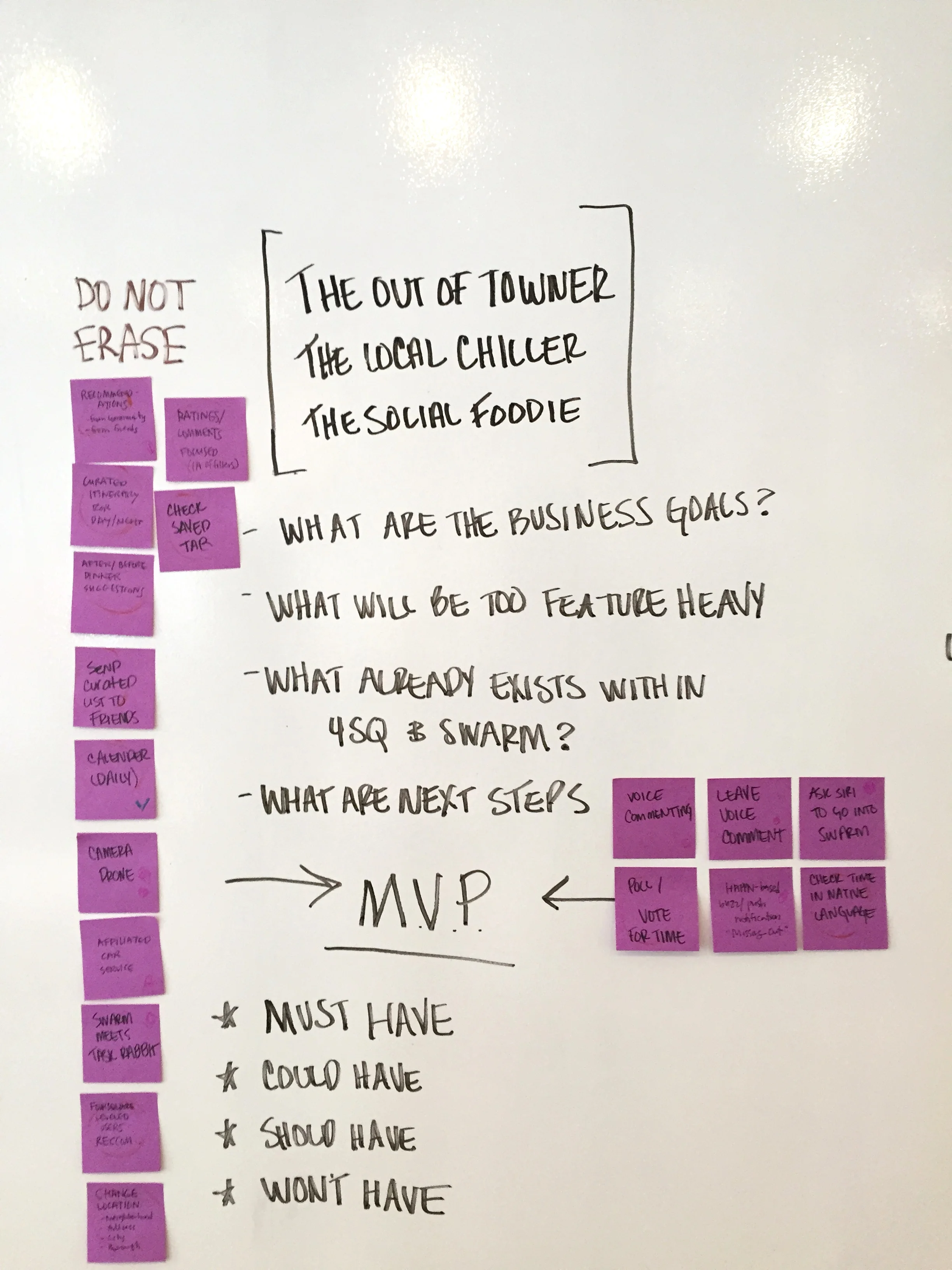
OPPORTUNITY
Foursquare is already known for it’s community-based, real-time location sharing features. We proposed to create a feature within the Foursquare and Swarm app in which users can view and report the wait time of restaurants. When considering design, we wanted to create an internationally accessible and aesthetically pleasing app, based off the current brand.
ROLE Project Manager | UX Designer
DURATION 2 Weeks
TOOLS Typeform, Sketch 3, Invision, whiteboards, and all of the post-its.
deliverables
- Project Plan & Executive Summary
- Competitor Flows & Heuristic Analysis
- User Survery & Interview Question
- User Scenarios and Personas
- Foursquare & Swarm Userflows
- Appmap Update
- Clickable Prototype
- Usability Test Insights
platform selection
Our goal was to stress interactive engagement with users in Swarm. This requires native capabilities such as geolocation tracking, cloud-based services such as push notifications and reminders, access to users’ contacts, Facebook log-ins, fluid gestures via touch screen, and offline discovery.
MY ROLE
I served as the project manager, led the feature ideation and conceptualization stages, designed the swarm flow, and synthesized all of the research into a cohesive report. The competitive research, user interviews, usability tests, and deliverables were a collaborative effort.
understanding the split
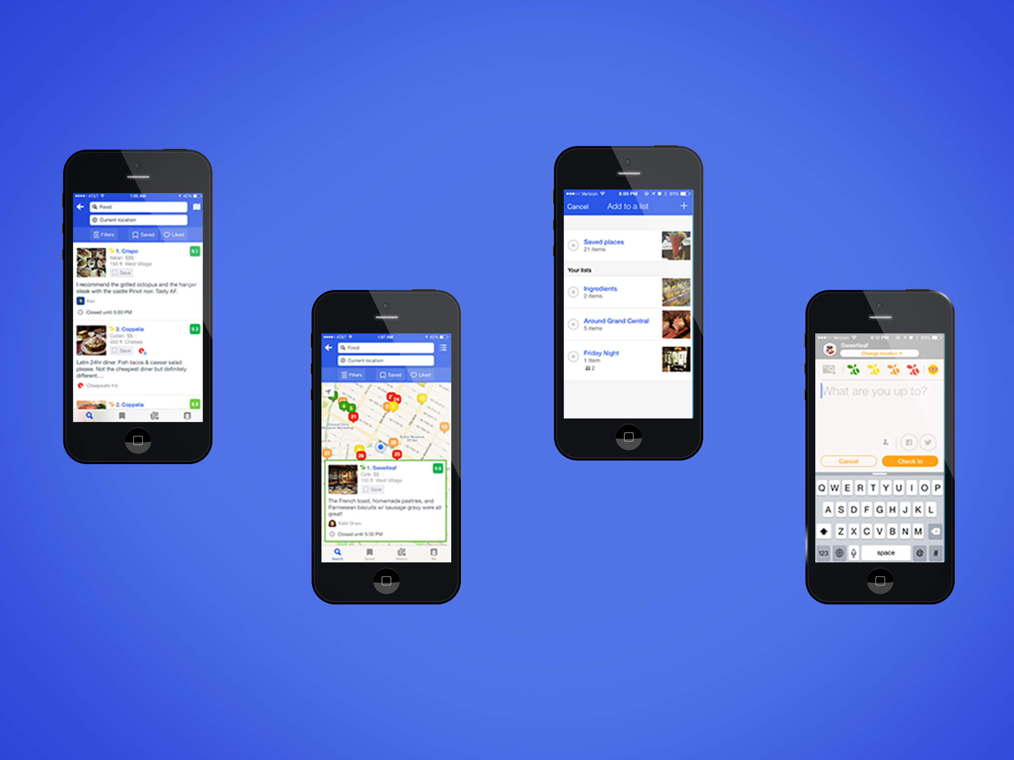
We came into this project realizing that we needed to design a seamless experience between two apps, Foursquare and Swarm. Swarm would receive the data and Foursquare would display it.
“Sometimes, you go to a place because you want something they offer (like a dish you’re craving), and sometimes it’s because you want to meet up with someone (like a friend who’s out in the neighborhood). But, after five years, we’ve seen clearly that it’s almost never both (it turns out nobody ever says, “I want fish tacos; which taco places are my friends at right now”
checking out the competition
don't try this at home
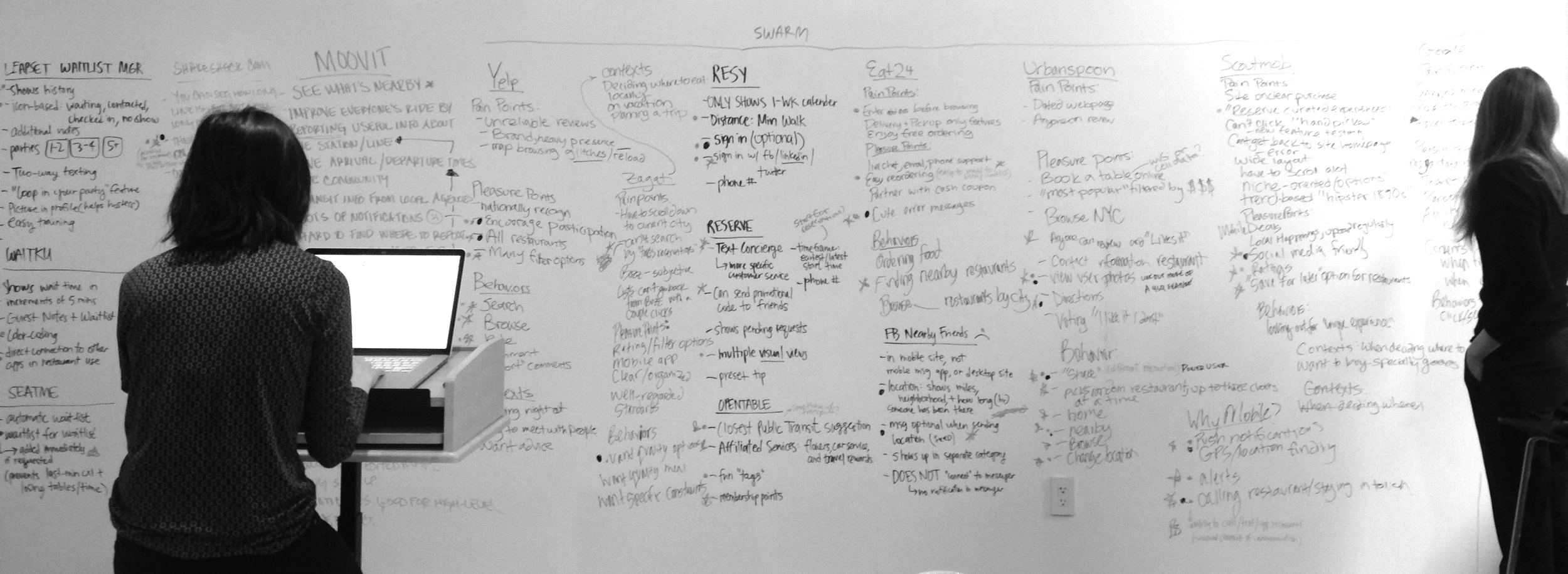
There were a lot of competitors, and I mean A LOT. We looked at over 15 different competitive and comparative companies and had more information about them then we knew how to absorb. In retrospect, it would have been smarter to stick to key competitors as this wasted a lot of time.
To get a high-level perspective we displayed them all on a whiteboard. We looked at everything from restaurant review websites to community-based transit apps. In sharing the pleasure points, pain points, context, and behaviors of users of these services we were able to dot-vote on characteristics and features that were applicable to our problem and ended up with a list of 25 features. Taking the most important comparative companies, we performed a heuristic analysis using Jakob Nielson's Usability Heuristics.
Heuristic Analysis (Click to zoom)
When have you waited?
Narrowing down a selection of interviewees that we obtained from a screener survey made in Type Form, we recognized our KPI’s and grouped questions according to specific areas of interest that would prove useful in building our feature.
Waiting:
- When have you waited?
- What were your frustrations with waiting?
- Did anything help you wait?
Dining Experiences:
- How/Where do you find a restaurant to eat at?
- Where was the last place you ate at? How was it?
- Tell me about a time you had to make last minute plans.
The Restaurant Wait:
- Tell me about a time you had to wait for a table.
- Tell me about a time you had to go to a restaurant that didn't have reservations.
- Tell me about a time you had been on a restaurant wait-list.
- What was the process?
Making a Reservation:
- What pain points can you think of when making a reservation?
- What pleasure points can you think of when making a reservation?
Restaurants in NYC:
- What pain points can you think of when choosing a restaurant in New York?
- What pleasure points can you think of when choosing a restaurant in New York?
Dining Context:
- Does location/neighborhood effect the restaurants you choose?
- What is a comfortable sized restaurant (that doesn’t take reservations)?
- Who do you go to restaurants with (party size/circumstances)?
- At what time of day do you eat out?
- Do you like to cook?
The Social Aspect:
- You mentioned “x” app, what do you like about it?
- Are there other social media apps you enjoy using and why?
- Do you post about the restaurants you frequent?
- Where do you post?
The NYC Restaurant Scene (click to zoom)
We learned that:
- Users mainly eat at restaurants with friends or in groups for dinner
- Users don't like not knowing how long the wait will be and still having to wait regardless of having a reservation
- Users are more likely to dine somewhere nearby unless they were looking for a specific cuisine.
- Some, but not all, are socially active and leave reviews.
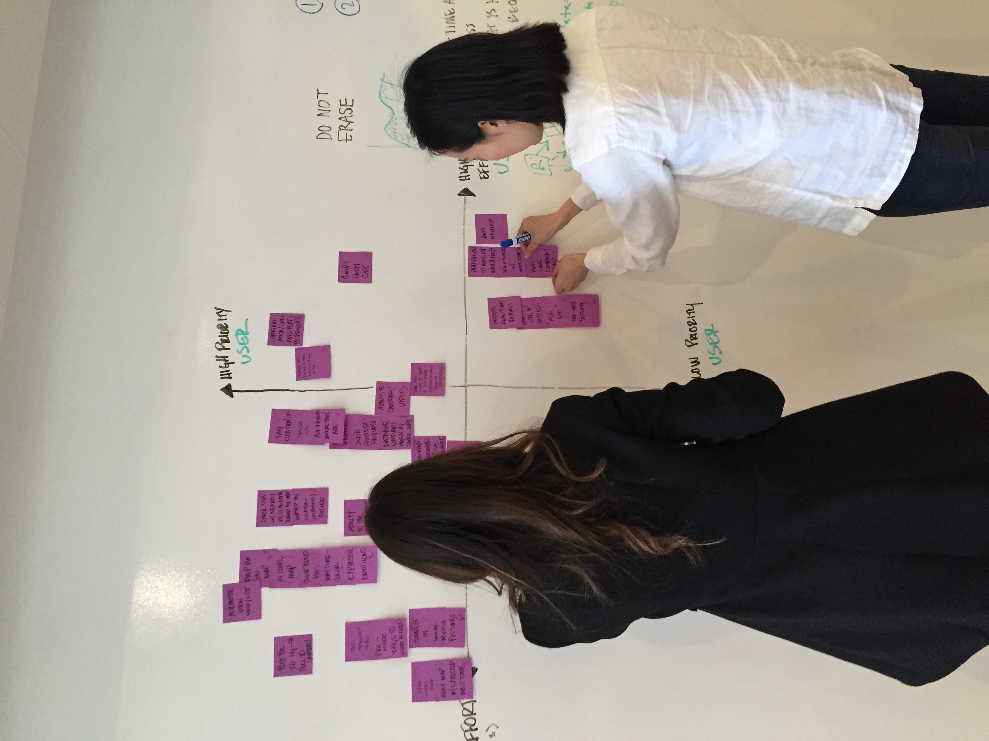
feature ideation
I. USER STORIES & FEATURE PRIORITIZATION
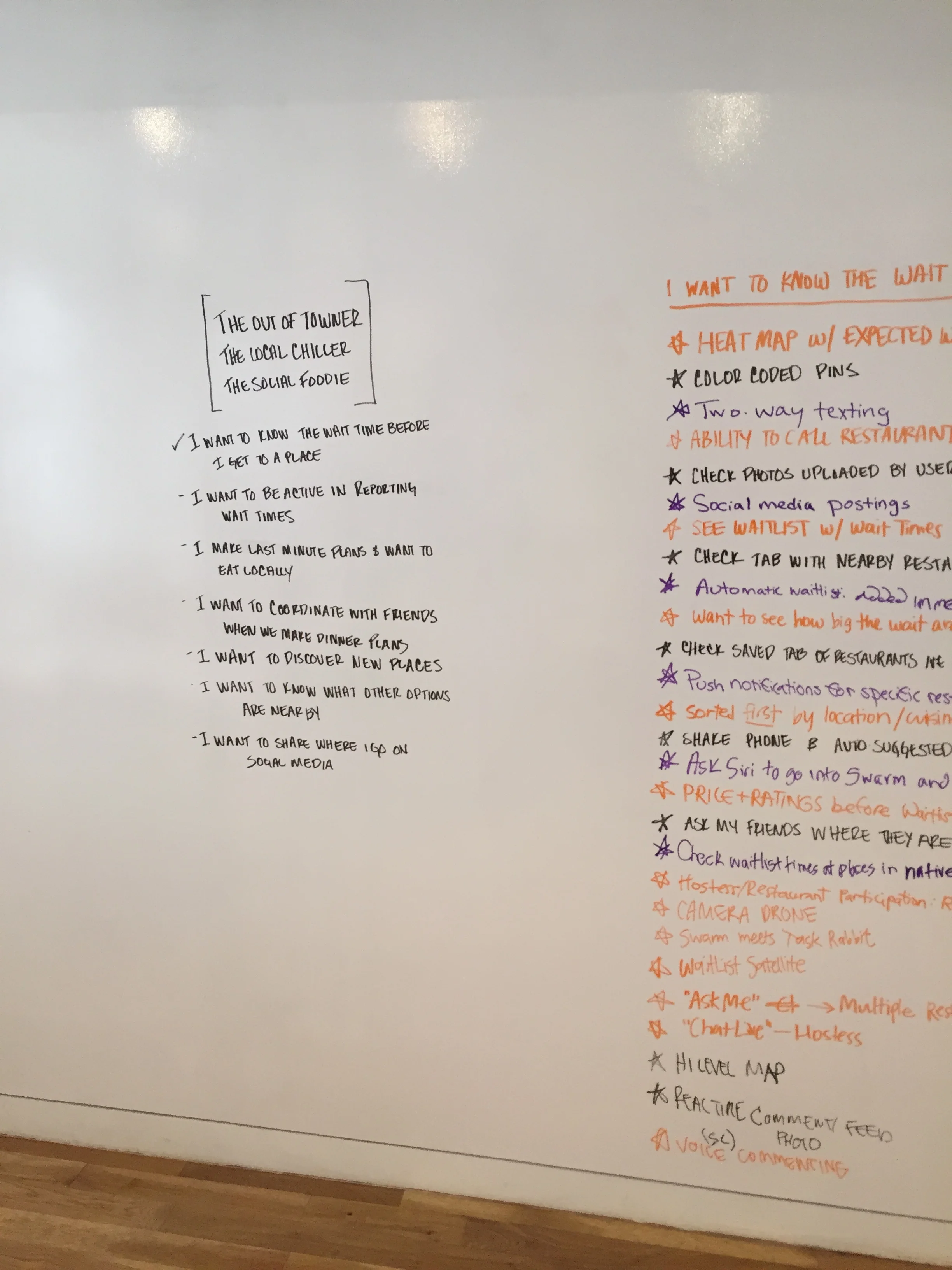
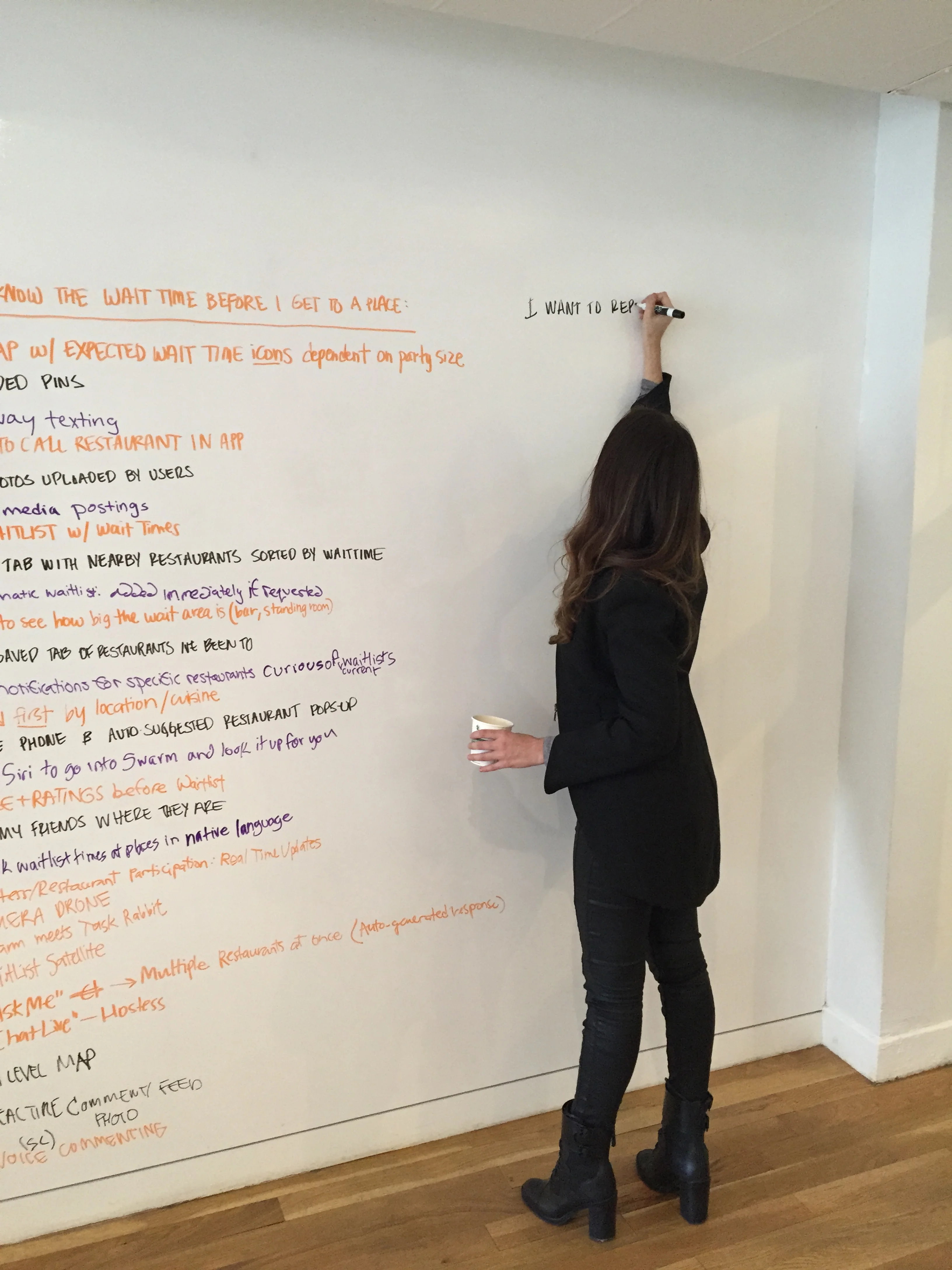
From these interviews we created 7 user scenarios that we used to brainstorm ideas. The main scenarios we used were:
- I want to know know the wait time before I get to a place
- I want to be active in reporting wait times
- I want to be able to coordinate with friends when we make plans
- I want to know what other options I have nearby
- I want to make last minutes plans
- I want to discover new places
- I want to share where I go on social media
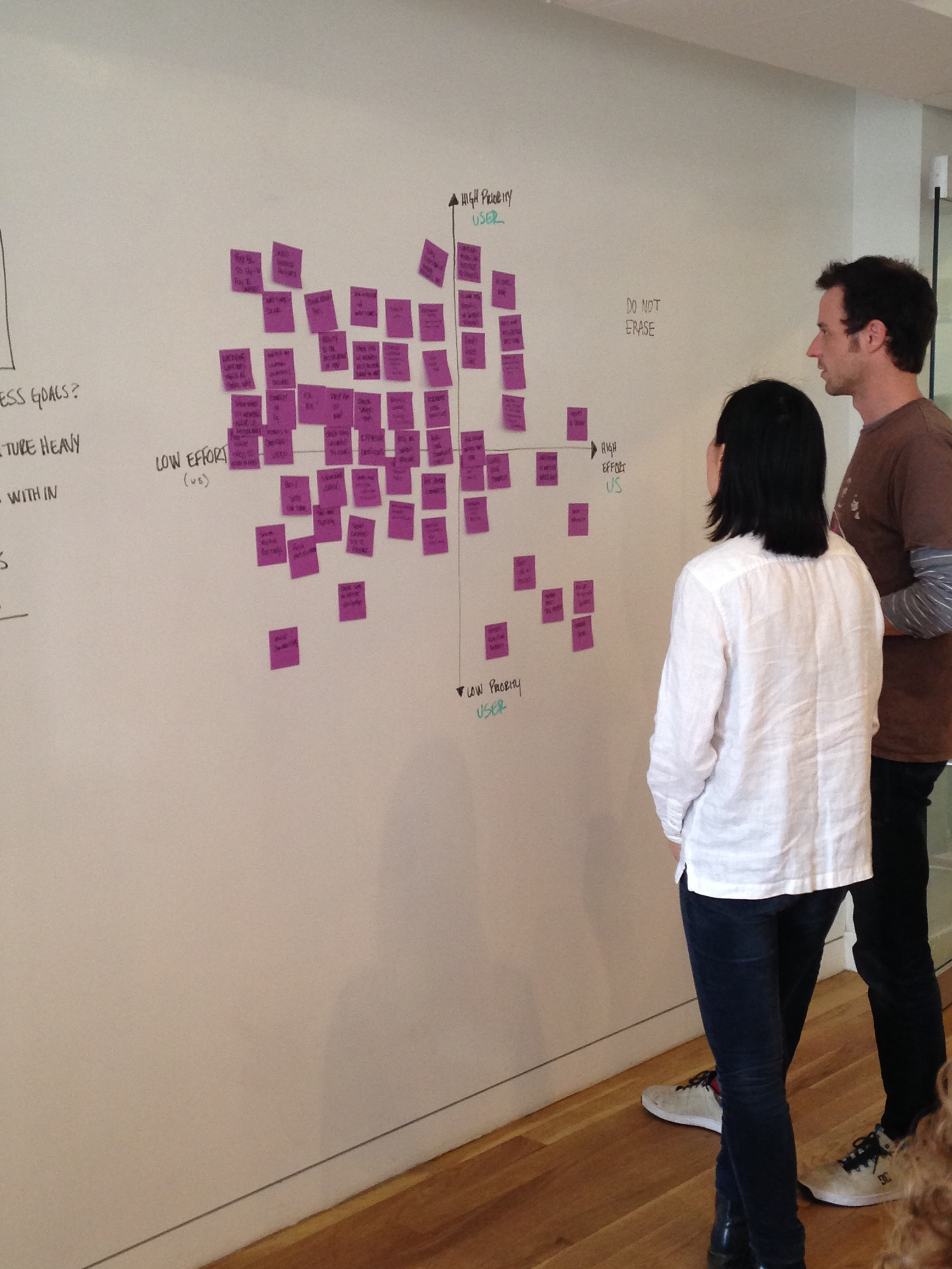
III. narrowing it down
Now that we had a better understanding of how the developers would work on this feature, we continued to trim away at unnecessary ideas to get to the core solution.
Although our most important feature would be difficult to build by developers because it requires a non-existing algorithm, we balanced it out by picking lower effort features for the rest of our feature list. This is the list of features with which we began sketching, but after much consideration trimmed it down further before the last round of prototypes.
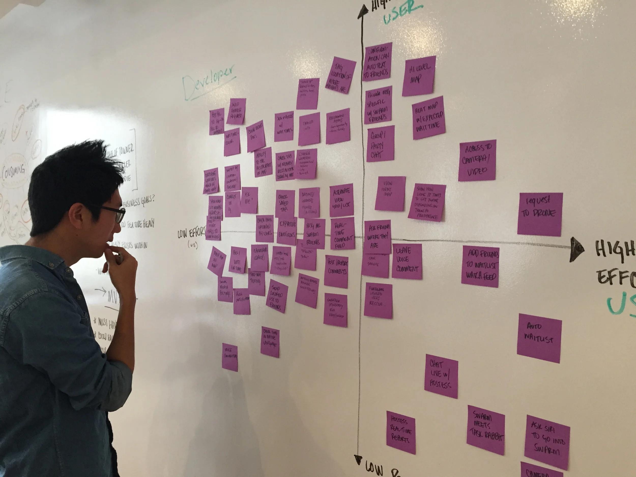
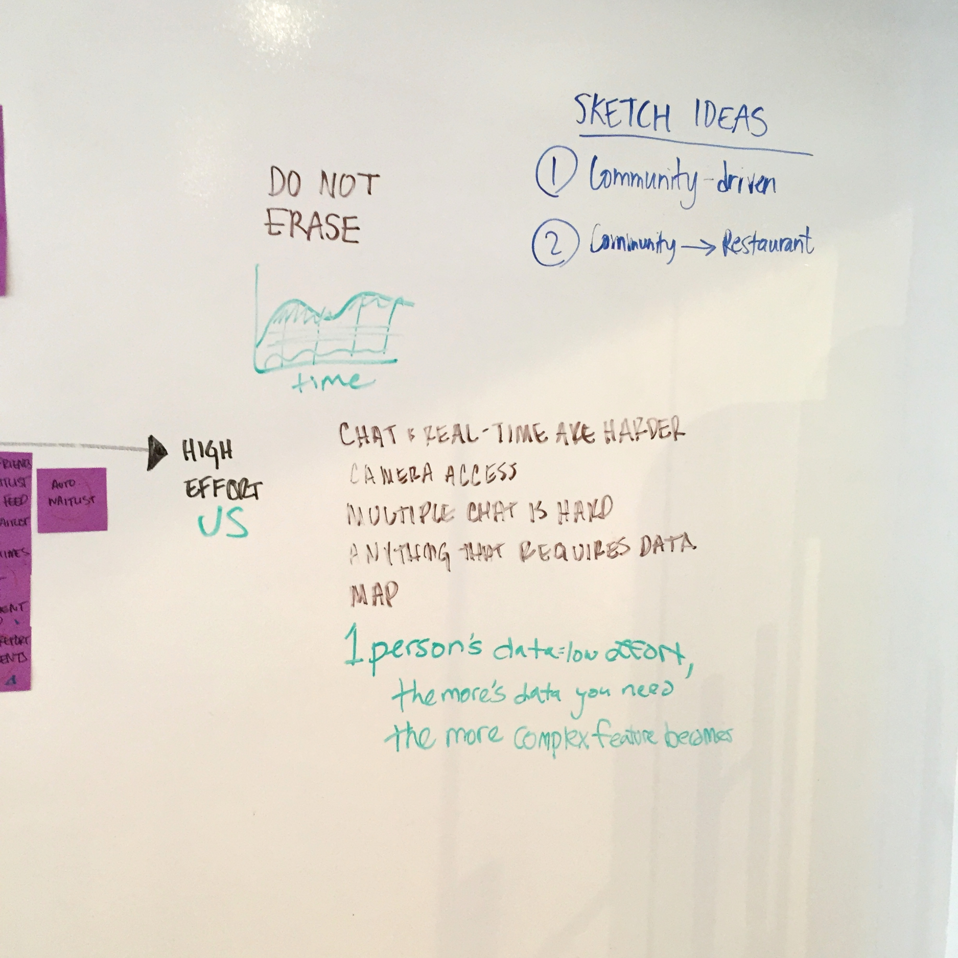
II. a different point of view
We spoke with three developers and asked them to sort our ideas according to implementation difficulty. This allowed us to prioritize features in a realistic manor.
We learned that the chat and real-time features we thought of are harder to implement. The developers explained to us that anything that requires data is easy although, the more data you need the more complex a feature becomes. Algorithms are difficult and the most time consuming for implementation.
(click to zoom)
the turning point
We brainstormed ideas for group coordination, restaurant waitlists, high-level maps, and the ability to call restaurants within the swarm app, but we had a problem. The whole point of this app was for people to be able to report on and see the wait times of a restaurant, but how would that even work?
What use is there in someone reporting that their wait-time is 15 minutes for their party-of-two if I want to go with five friends? And let's be real here- How often is it that the wait time you get from a hostess is actually accurate? After contemplating different possible algorithms, which would now require all places listed to report on their seating capacity, as well as other edge cases, we came to the conclusion that the effort required would outweigh the benefits. Now we have to ask every restaurant on Foursquare to add their seating capacity. Foursquare is a community based app, but this felt all too technical and unrealistic.
and so "the crowd observer" was born
A community-based feature that would allow users to see how busy a place is before they get there (in Foursquare) and report on the crowd (in Swarm)
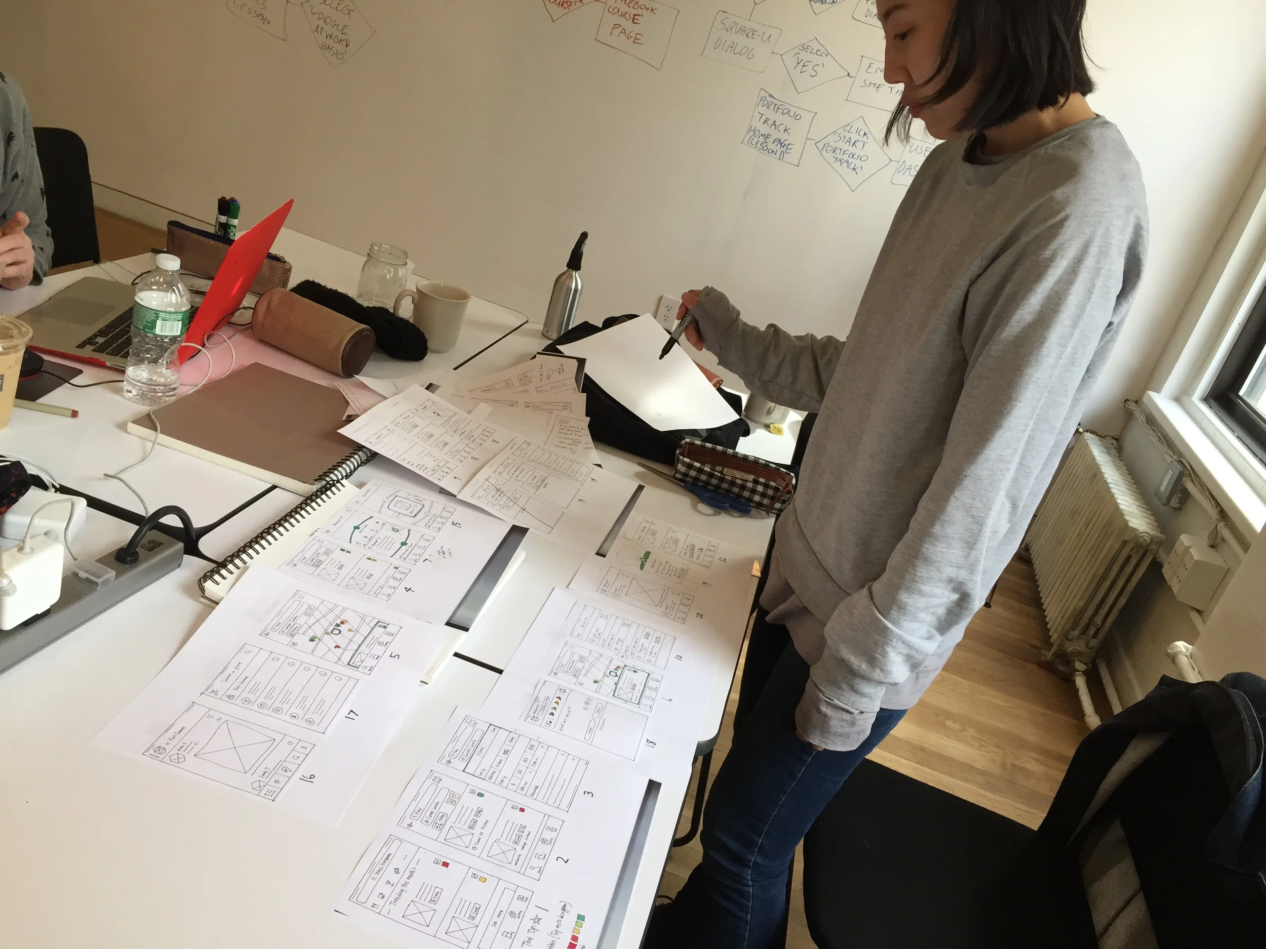
test early and often
We didn't waste any time in creating user flows, sketching up some paper prototypes, and putting our idea in front of users. It was important for us to prove concept before diving in too deep. It worked! Not to say that there weren't still a few kinks we needed to work out, but we felt confident enough to skip over to medium-fidelity wireframes and perform some more tests.
(click to zoom)
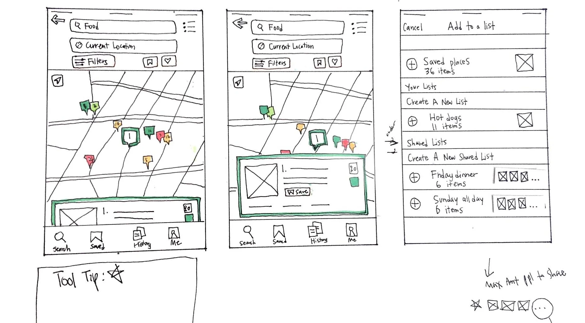
Crowd Observer in Map View
user testing
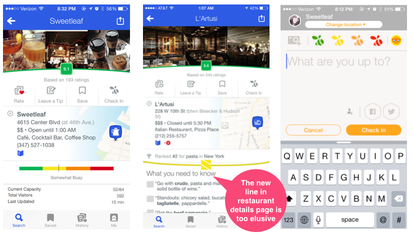
different ui for the same solution
Playing around with different UI to see how users reacted to the new feature, we A/B tested two ways of representing the crowd observer in Foursquare.
What happened? Users completely overlooked it. It was as if it wasn't even there. "What do you notice on this page?" - Nothing. (*!@!#($ :(
- Users did not understand what the beehive meant.
- Users didn't see the Crowd Observer on the Restaurant Profile page.
- Users understood the high-level map, but didn't know what the colors meant.
There was also an issue with inconsistency. The Crowd Observer in Swarm was represented by swarm bees, but in Foursquare it was a beehive. We took these findings and iterated on them
iterations & refinement
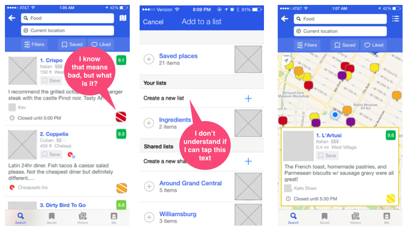
Foursquare List View
Changed beehive with Swarm bee for consistency between apps
Foursquare Restaurant Listing
Made the Crowd Observer more prominent and visible
Foursquare Saved Lists
Moved the + Create new list button for cleaner UI and less confusion as to whether or not is was a button
We went through about 4 iterations (that are not all mentioned here for the sake of brevity) before feeling confident that we had validated our designs and efficiently solved the problem.
check out the prototype
What i learned
SPEND TIME ON WHAT IS IMPORTANT-
Spending way too much looking at way too many competitors was not only overwhelming, but counter-productive. In this part of the process, quality is definitely more important to quantity.
all good ideas must die, so that great ideas can live-
Common sense told us that we should shift perspective as to how the Crowd Observer should work, but out of an overcomplicated and unrealistic idea came a simple usable feature.